L-O-A-D-I-N-G…(website check-in)
In the final part of our 5-part ‘ Getting Down to Business’ Guest series, we’re going to talk about websites! If you missed the last post, Paid Yourself Lately, read it here.
This is a big, loaded topic…WEBSITES.
I’m guessing you have one. Or you are dreaming about getting one soon.
These days, it’s pretty darn quick & inexpensive to have a web presence. But before you go down the path of checking out all the pretty themes, options, fancy features, etc – let me ask you this…
What is the purpose of your website?
 Seriously. Take a moment and think about this.
What do YOU want it to achieve? What is it’s raison d’etre?
Write down a few things that immediately pop into your mind.

Now, clearly, being photographers, our work is ‘visual’ – there is nothing wrong with having a visually pleasing site – and in fact, it better be as this is the first impression with your client.
However, there are many photographers who have websites that look pretty…IF you can wait for them to load. And then they do very little after that- if your potential client has the patience to watch the L-O-A-D-I-N-G screen for a few minutes (and as you know, people aren’t exactly ‘patient’ online!)
Sometimes you can’t even FIND the contact info for a photographer. Or you are stumped looking at a bunch of cuties little navigation titles that don’t mean anything to you.
Now, along with making it EASY for them to contact you, I also suggest finding a way to capture their information even if they aren’t ready to book…yet.
But why should they give you their contact info?
Maybe you are having a contest? Maybe you send out an enews with special offers and promotions? Perhaps you need to request a price list/portrait guide?
Whatever you decide, find *some* reason for them to leave an email.
Then follow up!
People often start the hunt for photographers long before they are ready to book. Don’t bet on them remembering your site, or book-marking it.
Find a way to get their info and permission to send them emails so when the time comes for them to book – you are a familiar face & your info is handy! (there are lots of inexpensive auto-responders out there -look into aweber.com or mailchimp.com)
Music or No Music?Lisa did a great post on this awhile back, which you can read here. My take – don’t FORCE music on your clients. And as Lisa says, make sure you have permission to use the music on your site!
Prices – to show or not to show?
There is some debate around this, and in the end you need to do whatever feels most comfortable to you.
Here is why I have chosen to take my full price list off.
1. I don’t want to attract ‘price shoppers’These are people who will bounce from site to site, looking at the price of 5x7s and make their decision based on who has the cheapest print.
I’m not saying there is anything wrong with this – it simply isn’t the type of client that will enjoy what I have to offer.
By including a “Portrait sessions from $X and full collections from $Y” I can let individuals determine if I’m in their budget range. And, if I am, they can request a free portrait guide.
2. I wanted a reason for them to give me their contact informationWhen potential clients sign up for the portrait guide, they are sent an auto-generated email with the download link, and put into an auto-responder sequence.
I also ask them if they would like to receive special offers & news updates.
This gives me permission to stay in touch.
You might find the perfect client, offer them the perfect solution to their needs, but, the timing isn’t right. You want to be sure that when the timing IS right, YOU are the photographer they are thinking of!
Types of Photos to Showcase
Ok, this one seems pretty obvious, but somehow we can lose sight of it.
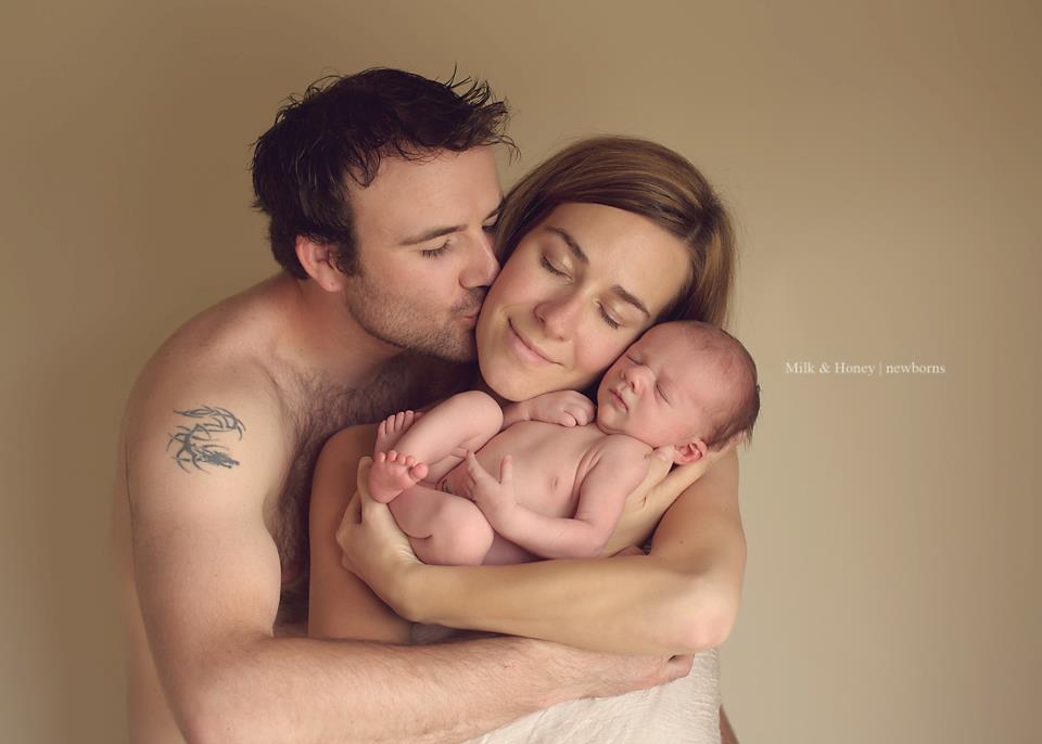
Show the types of images you are most interested in taking more of!Do you want to focus on newborn – show newborns!Do you love candid family photos – show candid family photos!
And, put your strongest images online.
Don’t get into the mindset that you need to grab an image from each of your most recent sessions. Or, maybe you always do a blog post or facebook update after a session – in this case, ok, you will be.
But for you main portfolio – the one that a potential client is going to browse – make sure your strongest images are there.Another thing that happens is we get lazy…or busy…and we don’t update this portfolio, and it no longer reflects the work we are currently doing (or the types of images we enjoy creating!)
So, every 6 weeks – 2 months, make a note on your calendar “Review online portfolio” – and keep it fresh. (so you’ll want to have the ability to edit your site yourself!)
Which could lead us into the whole, what tools/site/program should you use and should you build your site yourself or hire it out. But that is a topic for another day!
If you could use a weekly dose of inspiration in your mailbox, sign up for our weekly lovenotes! (…it’s FREE!)
share the love
[Sassy_Social_Share]
related
Posts
I'm
Lisa DiGeso
I’m on a mission to create uplifting online experiences for photographers ready to elevate their art, their business and their mindset.(...and have fun along the way!)


