Facebook – the only thing for certain…is change!
If you haven’t already heard, Facebook has changed their rules regarding timeline photos (again!)
This time – it’s good news for us business owners!
According to the new rules (for now!), your timeline image can include…
- your studio website, phone number, address etc
- specific calls to action (ie: like us! Share with your friends, arrows pointing to tabs/like buttons)
- special offers and specific promotions
- the good ol ‘thumbs’ up image,etc
However – all this must fall within their 20% rule – which means, your text + promo material cannot be more than 20% of the whole image.
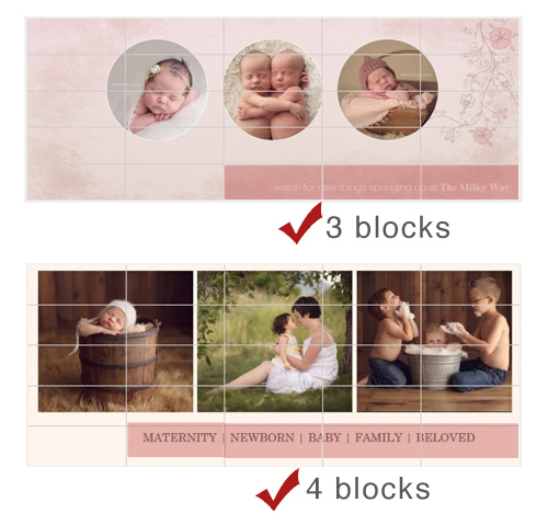
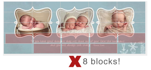
BUT – and this was news to us – they ‘enforce’ the rule using a 25 block grid over the image – if text falls in more than 5 of the blocks, it fails the test!

So…uh, with that last template we gave you, be sure to turn off the layer with the quote!
Because while the text is less than 20% of the image, it does NOT meet the grid test!
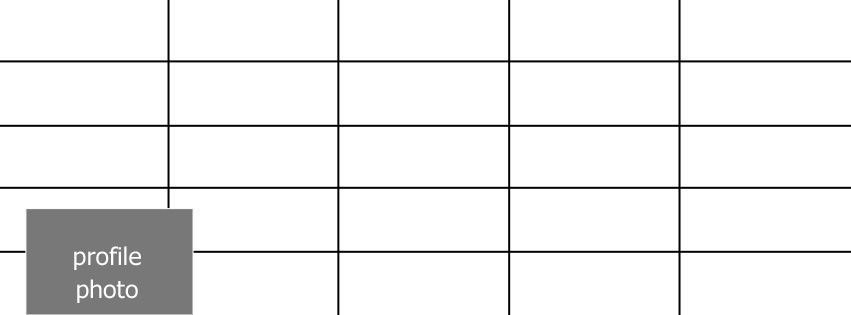
Here’s a free grid template you can use when creating or modifying your timeline cover to make sure it meets the new rules! (plus you can check where that profile photo ends up so you don’t cover important info!)
Scoop this template for FREE here!
Want to be sure your current image meets the rules? Use this handy online tool!
share the love
[Sassy_Social_Share]
related
Posts

I'm
Lisa DiGeso
I’m on a mission to create uplifting online experiences for photographers ready to elevate their art, their business and their mindset.(...and have fun along the way!)


